Overview: Landing Page
This landing page was created for a digital healthcare program for people with musculoskeletal pain, focusing on people with low back pain.
Role: Lead content designer
Collaborated with: Product owners, product designers, researchers, developers, CMS team, marketing, legal, and leadership.
Tools: Miro, Confluence, Invision, Microsoft 365
Time: 9/1/2022-1/1/2023
Right away, we had a major challenge:
We legally could not provide care to people, meaning there were no doctors directly involved with the program. People received their own Care Advocate, a registered nurse or physical therapist, but they could only answer questions people had or guide them to the right resources to manage their pain on their own. We had to be very careful with wording to make sure we stayed within the legal lines of not providing care.
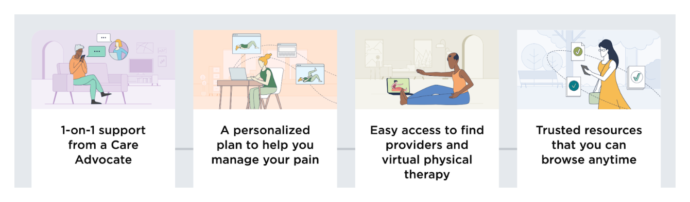
Leadership wanted us to highlight 4 important points:
1. The program was personalized
2. It would help people manage their back pain and increase their mobility
3. It was a digital program
4. There was no cost to sign up because it was included in their health plan
Step 1: Evaluate original marketing copy
I received copy from the marketing team to start with. The team sent over a Word document with copy that they put together. It was a lot of copy for a landing page, but we figured it was better to have too much at first and then cut it down once we did some testing. You'll be able to see the original marketing copy side-by-side with my updates in the next section.
The biggest issue with the marketing team’s copy was that the marketing team was not involved with the everyday operations of the program, so they didn’t fully understand the value of it. A lot of the copy was vague and after reading it through, I still didn’t understand what the program was for and wasn’t sure people would be convinced enough to sign up for the program.
There were also inconsistencies within the copy. There were multiple CTAs that had the same functionality such as “Join today” and “Get started now” and there was inconsistent terminology throughout, such as using “personal nurse” and “care advocate” to reference the same person.
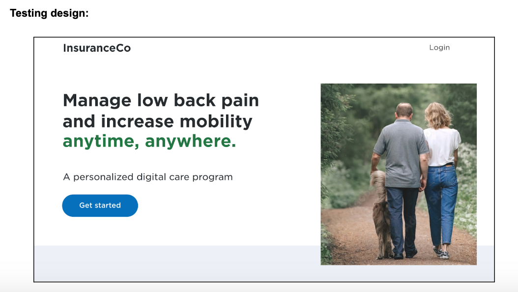
Step 2: Rewrite copy and create visual layout with the product design team to prepare for testing
I started reworking the copy. While reworking the copy, I collaborated with the product design team to create a visual design for the landing page so we could test it. When going through, I tried to make everything more detailed and fix inconsistencies with the terminology and CTAs.
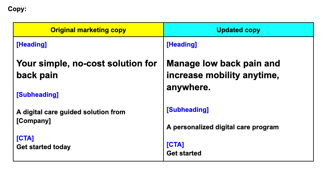
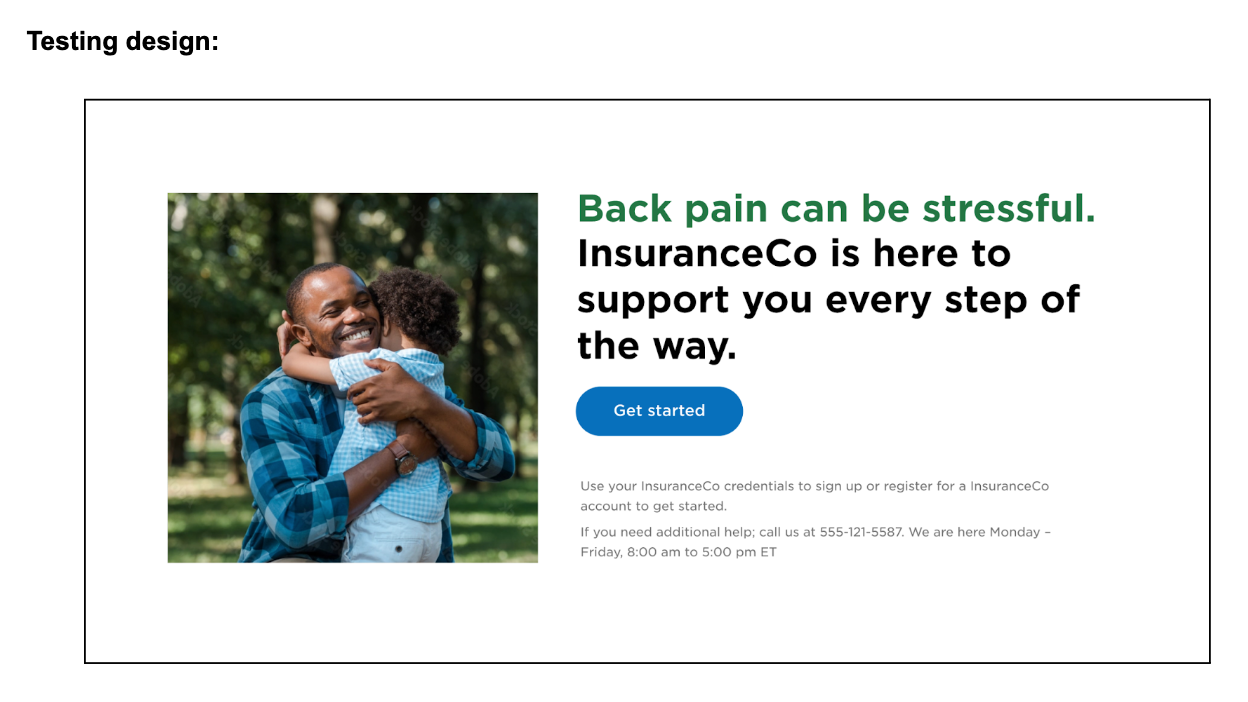
Here was my first pass. We ended up using my copy for the testing design.
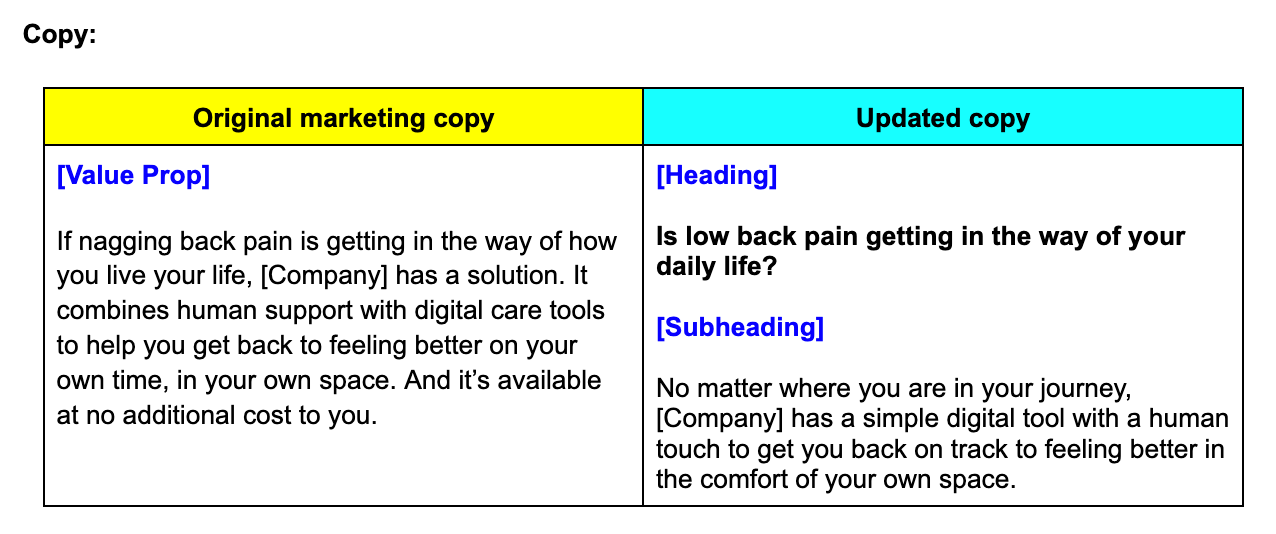
Heading and subheading
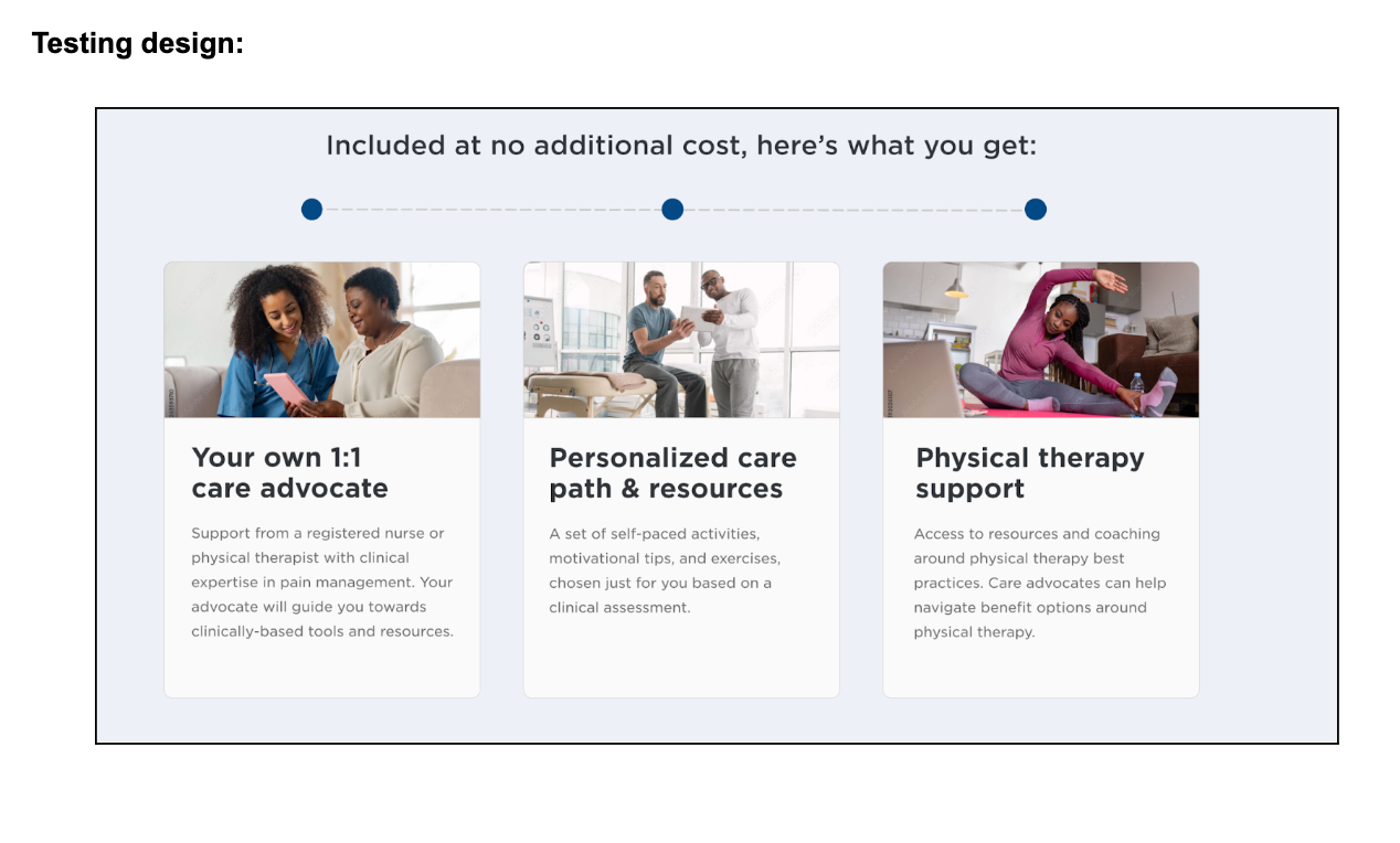
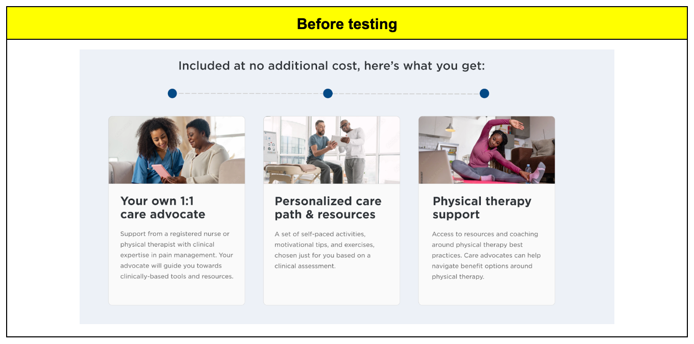
Value prop
There was a lot of copy in the beginning of the original marketing value prop, so I cut a lot of it and ended up using it in a later section. I still wasn’t completely happy with the tone at the beginning after updating, but I left it in and came back to it after testing.
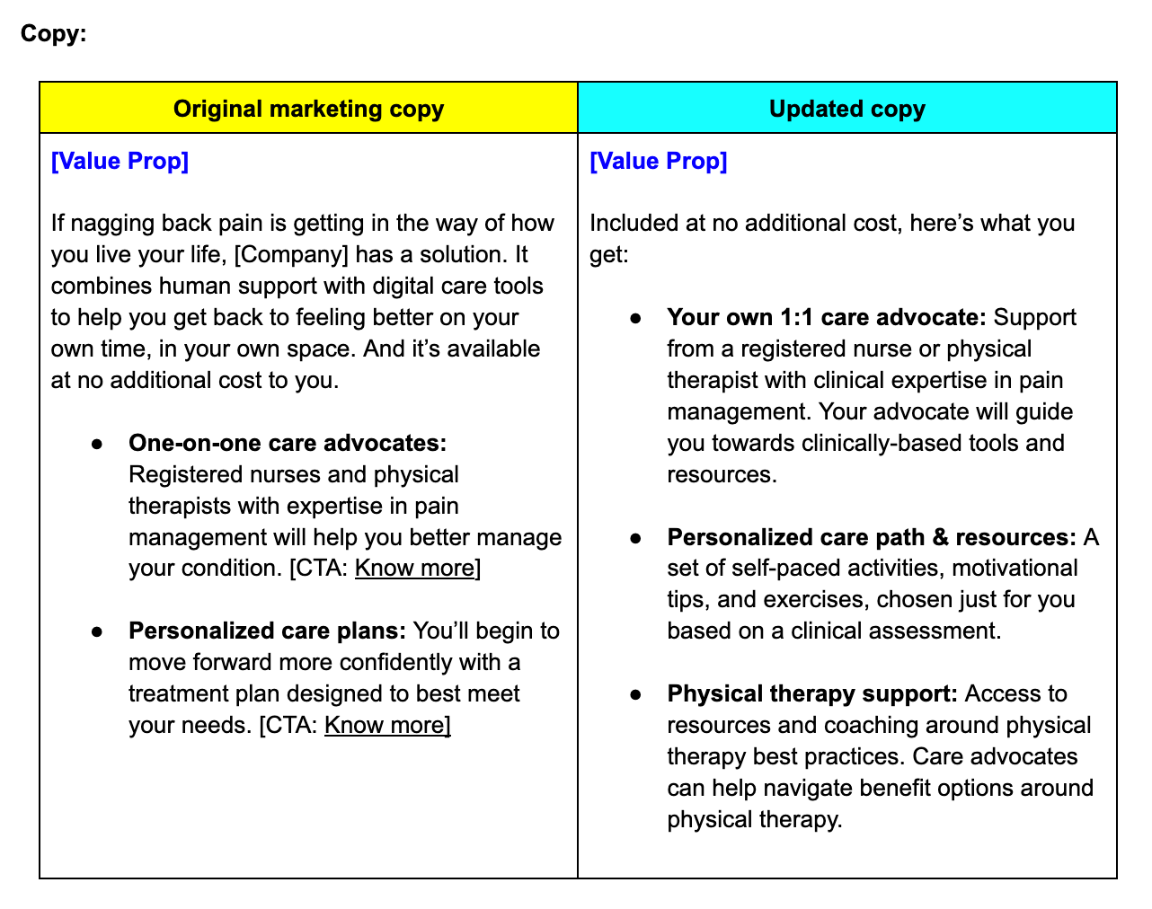
*Note: The physical therapy support bullet was not my copy and I didn’t have time to adjust it before testing. It was added in at the last minute because leadership wanted to highlight that benefit as part of the value of the program.
Heading and subheading 2
We originally had the FAQs in this section, but for testing, the design team ended up adding a second heading and subheading and moved the FAQs to the bottom of the landing page. This seemed a bit redundant to me, but I ended up reworking the original value prop marketing copy into this next section.
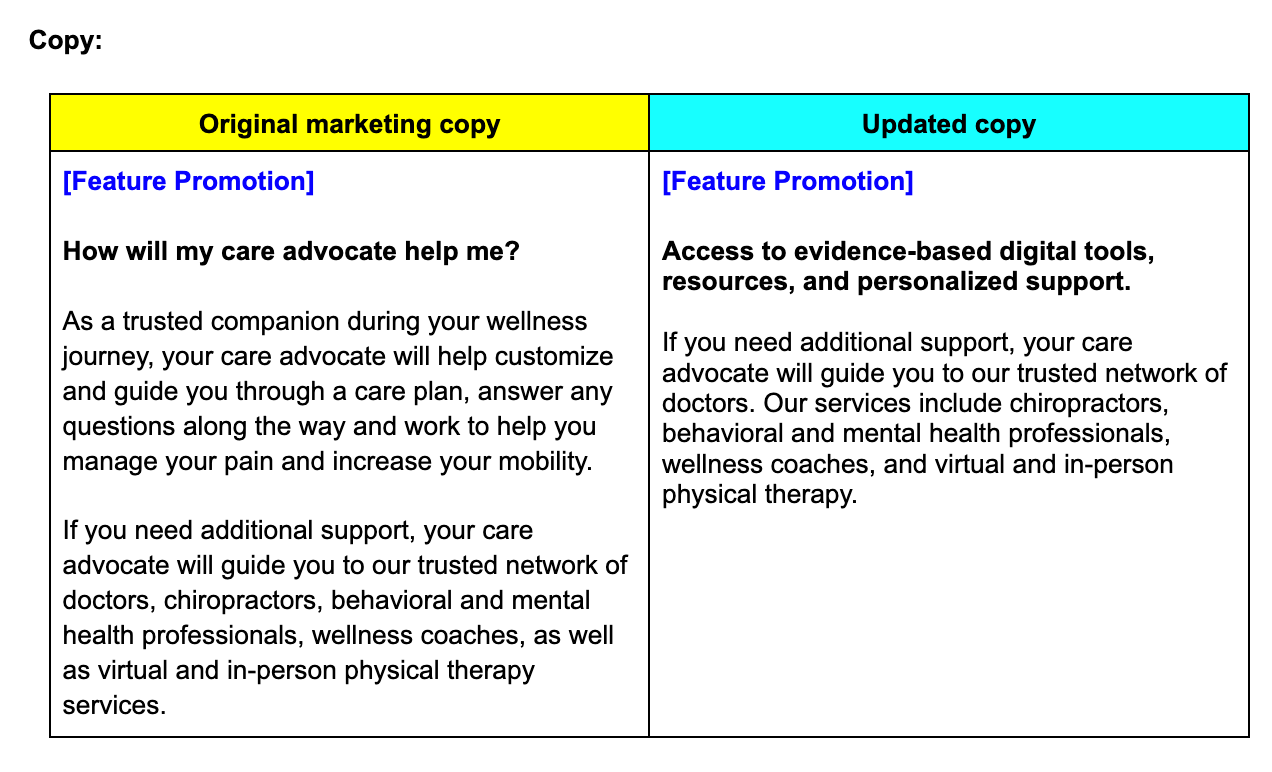
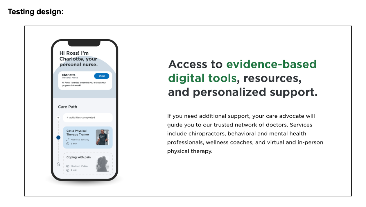
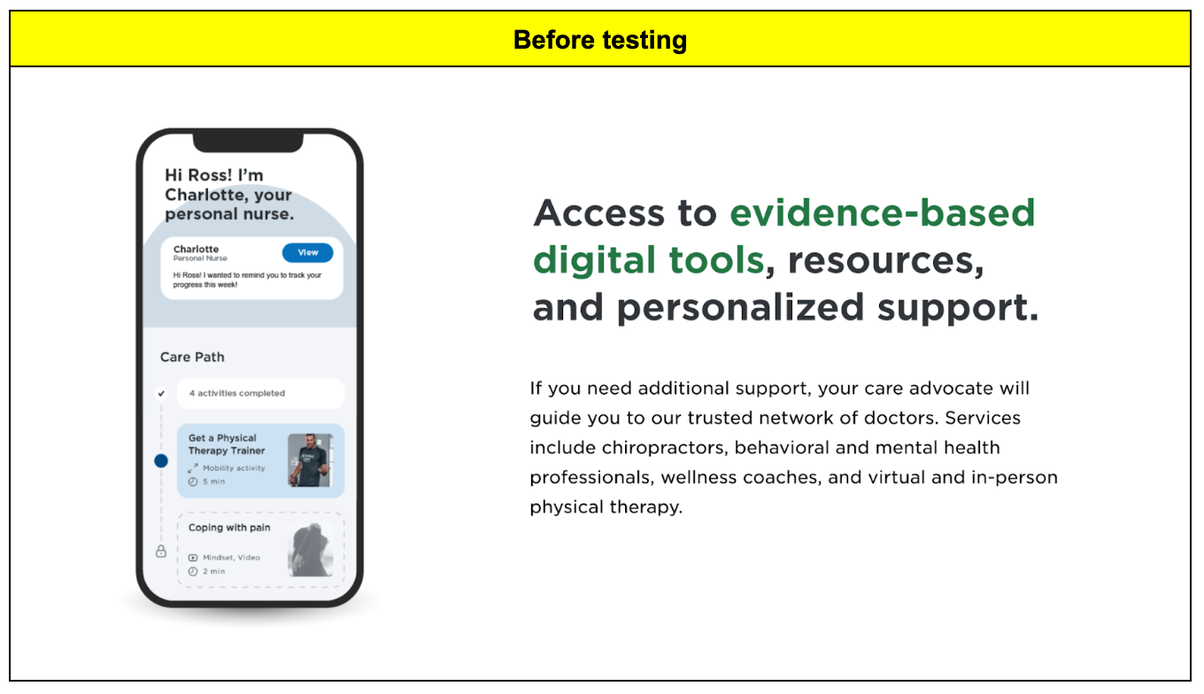
Feature promotion
Next came the feature promotion section. We wanted to showcase designs from the actual program itself so people could get a sneak peek of what it looked like. We added a mock version of the homepage to the design and I made the copy a bit more high-level instead of featuring only the care advocate.
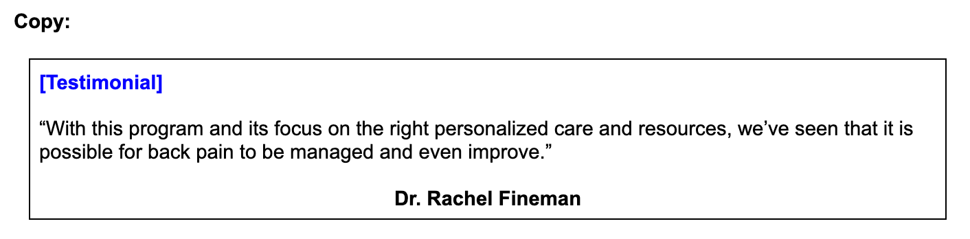
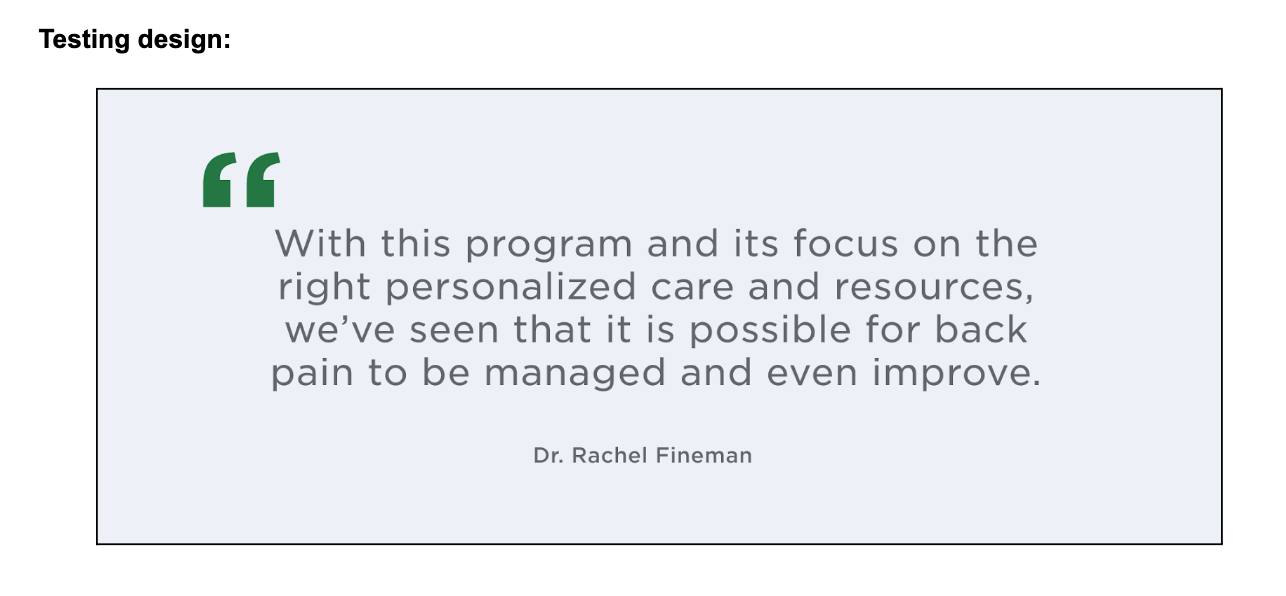
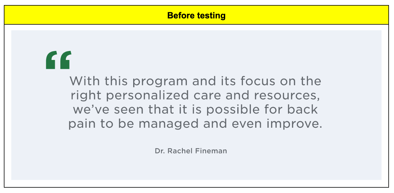
Testimonial
After the feature promotion, we added a section for testimonials. We wanted to validate the program in some way, either with testimonials from people that had gone through the program or medical professionals. We were interested to see how people reacted to them. For testing, we ended up going with a quote from a medical professional. I made up a quote to include for testing.
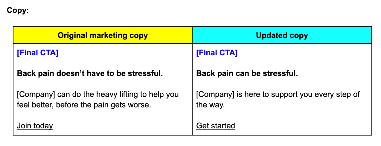
Final CTA
After the quote, we added another CTA.
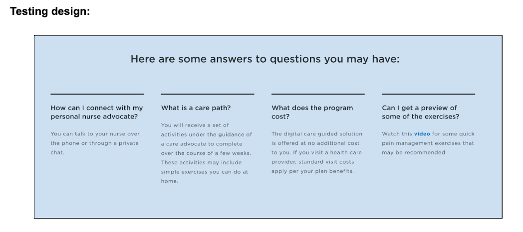
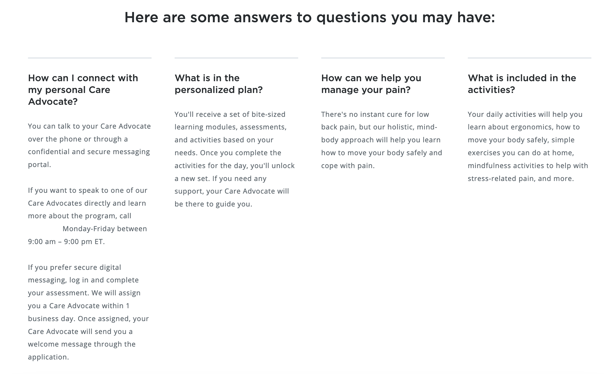
FAQs
The FAQs were moved below the final CTA. I kept the original questions, but updated the language and phrasing. The design team and I decided on 4 questions because it worked with the layout. Below is the testing design with the updated questions.
After reworking the copy and finalizing the landing page design, we worked with the research and testing team to formulate a plan for what we were going to test with users.
Step 3: Test, analyze results, and iterate
Because the landing page is so long, I'll only go through the most interesting insights and changes.
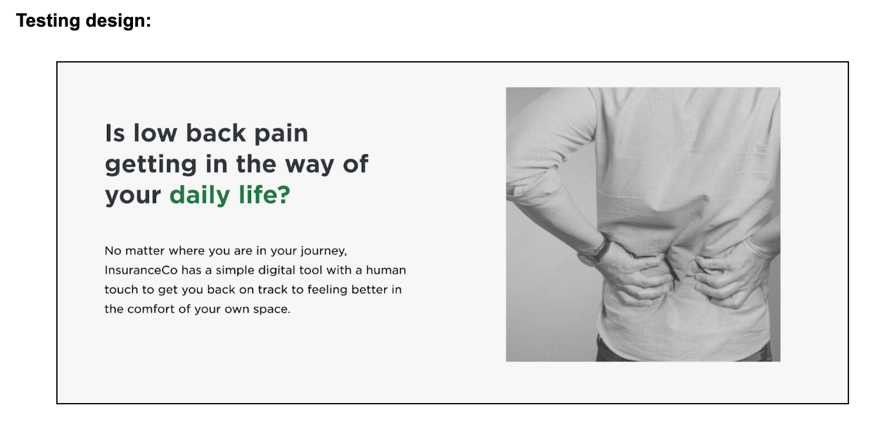
Heading and subheading
We were lucky to have the ability to test different copy options to see which ones were most effective. For the heading and subheading, we tested 3 different versions:
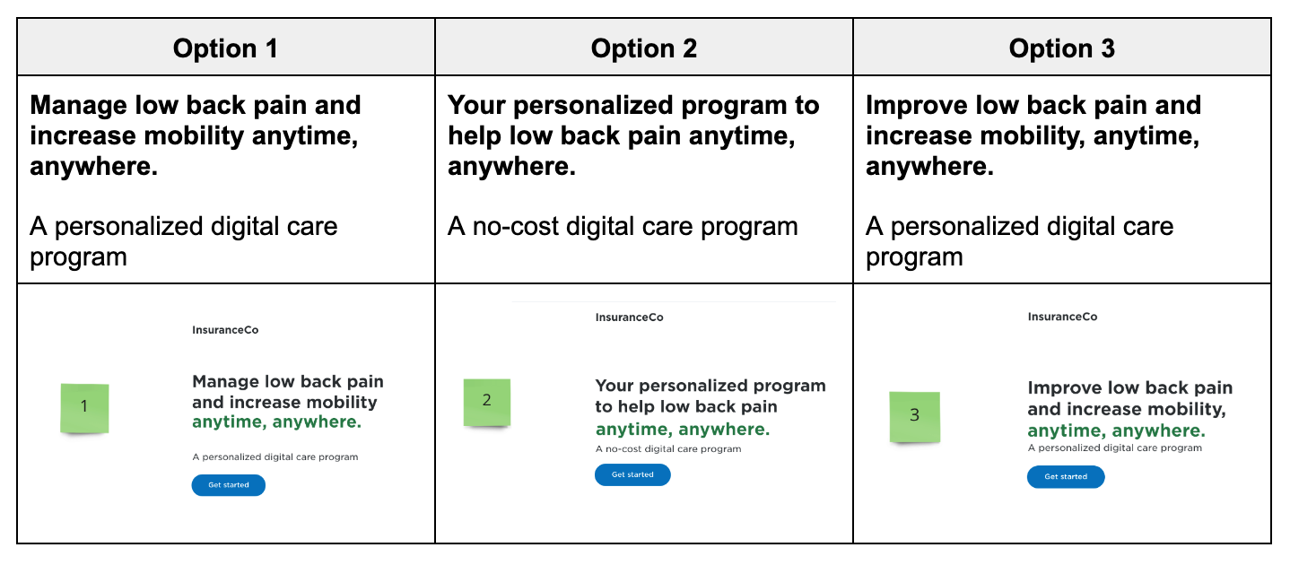
Insights
- Participants preferred #2, closely followed by #1.
- Some participants interpreted “Improve low back pain” to mean that their low back pain would increase and get worse, which was very surprising to me.
- “Anytime, anywhere” performed well. Participants understood it to mean convenient and digital.
- Participants were wary of headings that seemed to be a quick fix, in general. It seemed slimy to them, so we needed to make sure we were very careful with wording.
- There wasn’t enough information for participants to want to take action. They were confused by what the digital program was and what it entailed.
Updates
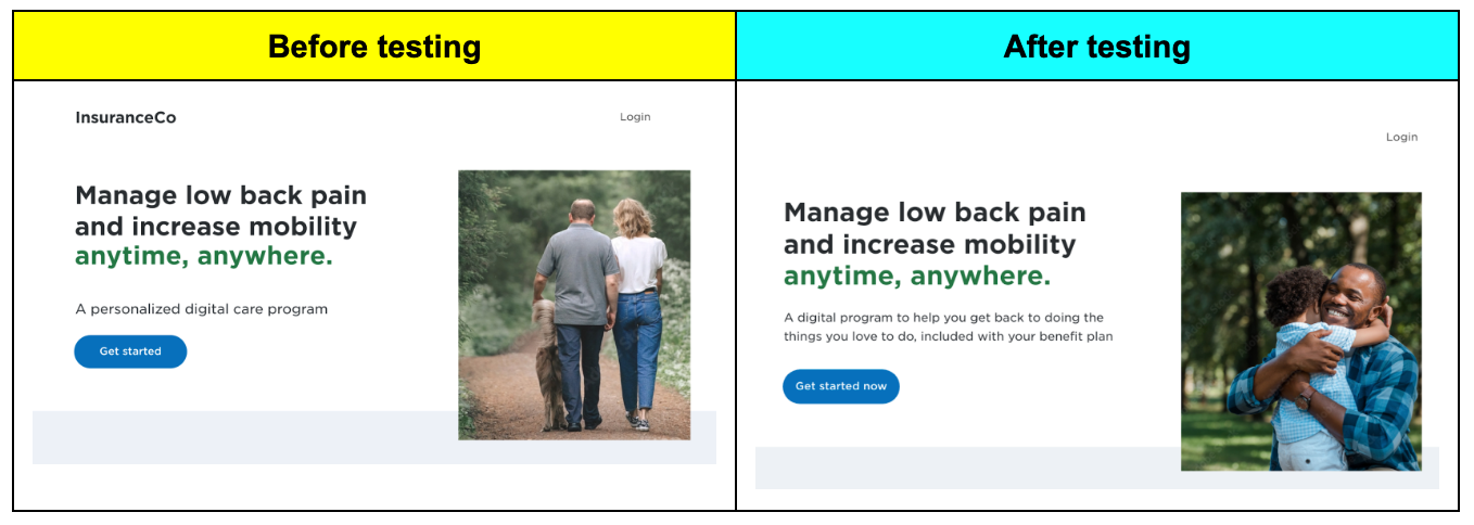
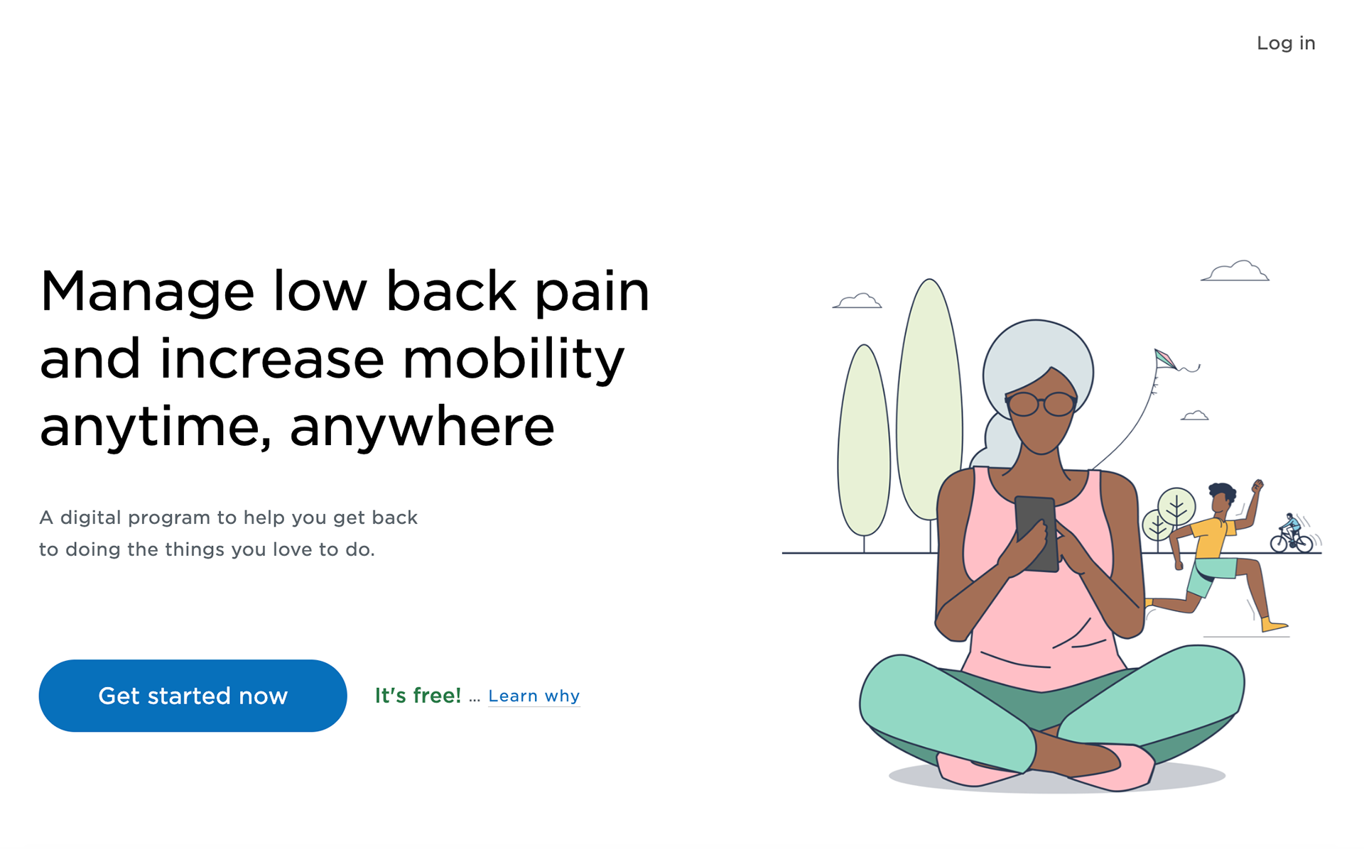
- Kept the original heading, but added more clarification to the subheading.
- Swapped the image at the bottom of the landing page and moved it to the top because it resonated more with people.
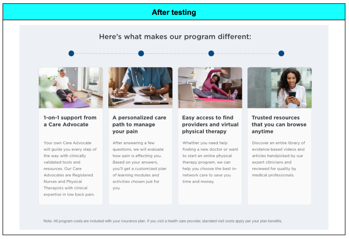
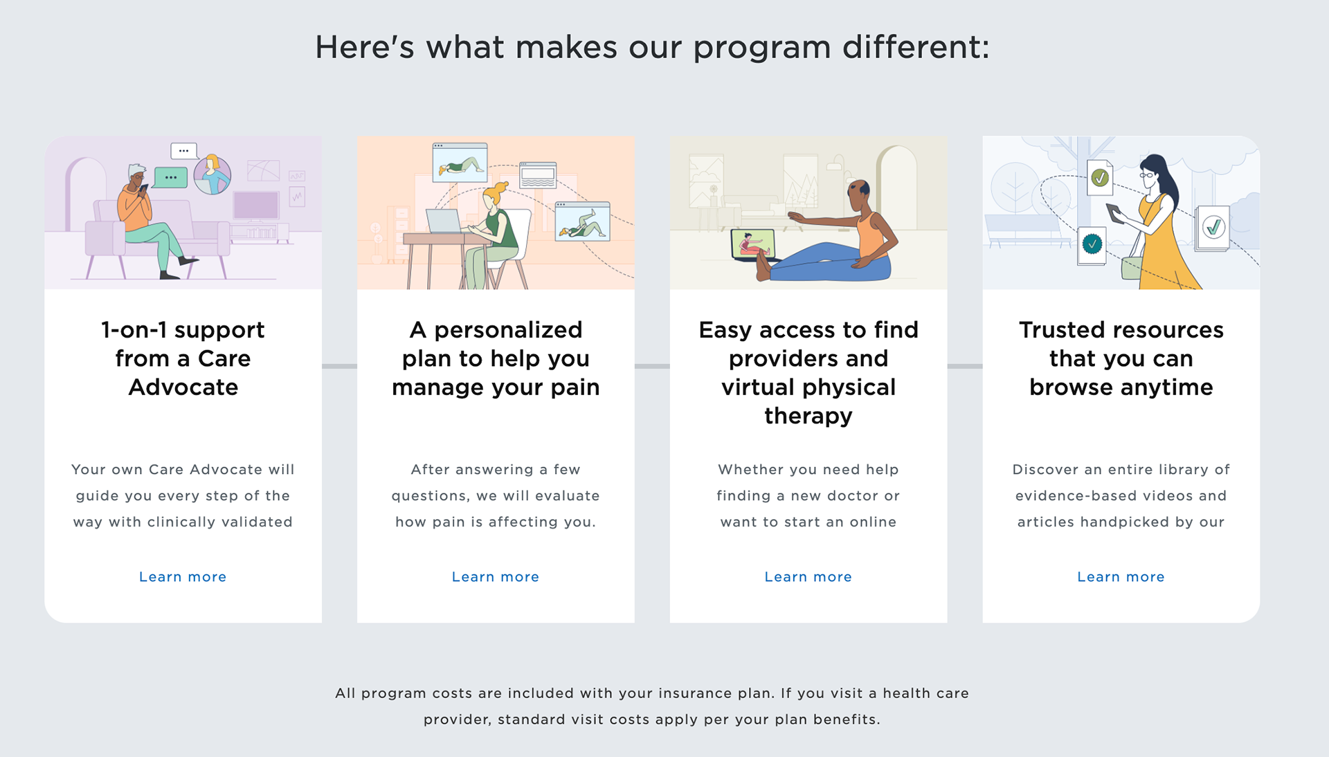
Value Prop
Insights
- Participants were confused and didn’t understand what “at no additional cost” meant. They thought there was a base price and these 3 features didn't cost more. It wasn’t clear that this was included in what they pay for insurance.
- The first two images didn’t reflect the digital aspect of the program and participants got confused. We needed to make it clearer that this was a completely digital program.
- One participant described the physical therapy support section as “word salad.”
- The meaning of the copy wasn’t always clear to everyone.
Updates
- Made the copy more direct.
- Added detailed descriptions and simplified the language.
- Added one more feature that was important to highlight.
*Note: We did have to be very careful of language here. Notice how we have “Easy access to find providers and virtual physical therapy.” Even though it sounds awkward, we had to use “find” because we could only legally guide people to the directory of providers, not give them direct access to providers.
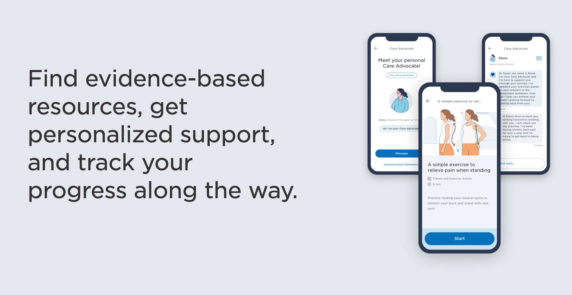
Feature Promotion
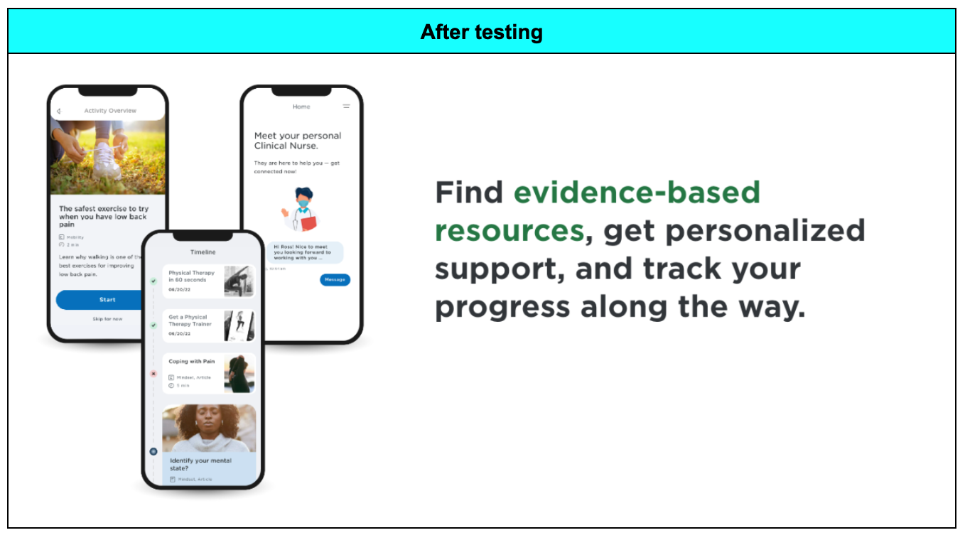
Insights
- Participants wanted to see more images of the app and how it worked.
- There was a disconnect between the image and the copy.
- “Care Path” implied that there would be more clinical intervention.
- There was confusion around how involved the Care Advocate would be, as the copy says we would “guide you to our trusted network of doctors.”
- Participants thought there would be doctors, chiropractors, and more providers involved with the program, not that they would be directed to a directory so they could find their own.
- Participants thought the Care Advocate would be interacting with their primary care provider, which is not the case.
- “Activities” implied physical therapy exercises/stretches and more active movement, instead of what they really were, which is learning modules with occasional stretches and exercises included in some of them.
- We needed to add in clinically-validated tools somewhere to emphasize the validity of the tools and resources.
Updates
- Added in 2 new screens.
- Updated the content to include the activity overview page, activity history, and personal Care Advocate.
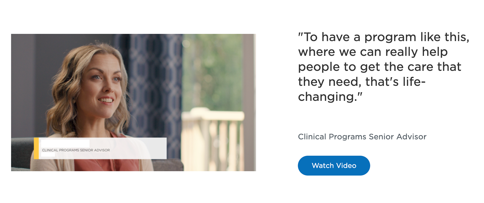
Testimonial
Insights
- People did not see Dr. Rachel Fineman as a credible source because there were no credentials listed and they didn’t understand how she was connected to the program.
- Participants preferred customer testimonials of people who actually participated in the program over provider testimonials. If it was a provider, they wanted to see credentials.
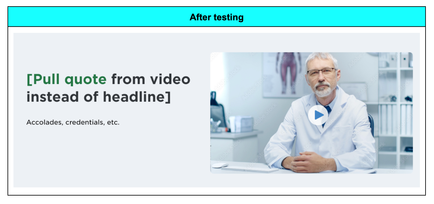
- Participants wanted video testimonials.
Updates
- Since the program hadn’t launched yet, we couldn’t include any customer testimonials, so we decided to add a video instead of a quote and add credentials. A video was ultimately created featuring the Clinical Programs Senior Advisor that I worked with closely on the program.
- We added a placeholder for the video while we worked on the video creation.
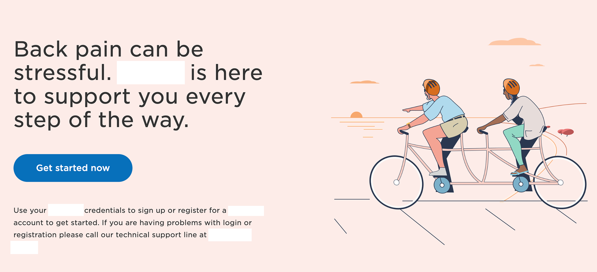
Step 4: Add custom illustrations
While I was reworking the copy from testing, we also wanted to create custom illustrations instead of using stock images for the landing page. The custom illustrations would carry over throughout the program.
I worked with the clinical program development team to provide themes, scenarios, characters, objects, and notes we wanted to depict for every single illustration.
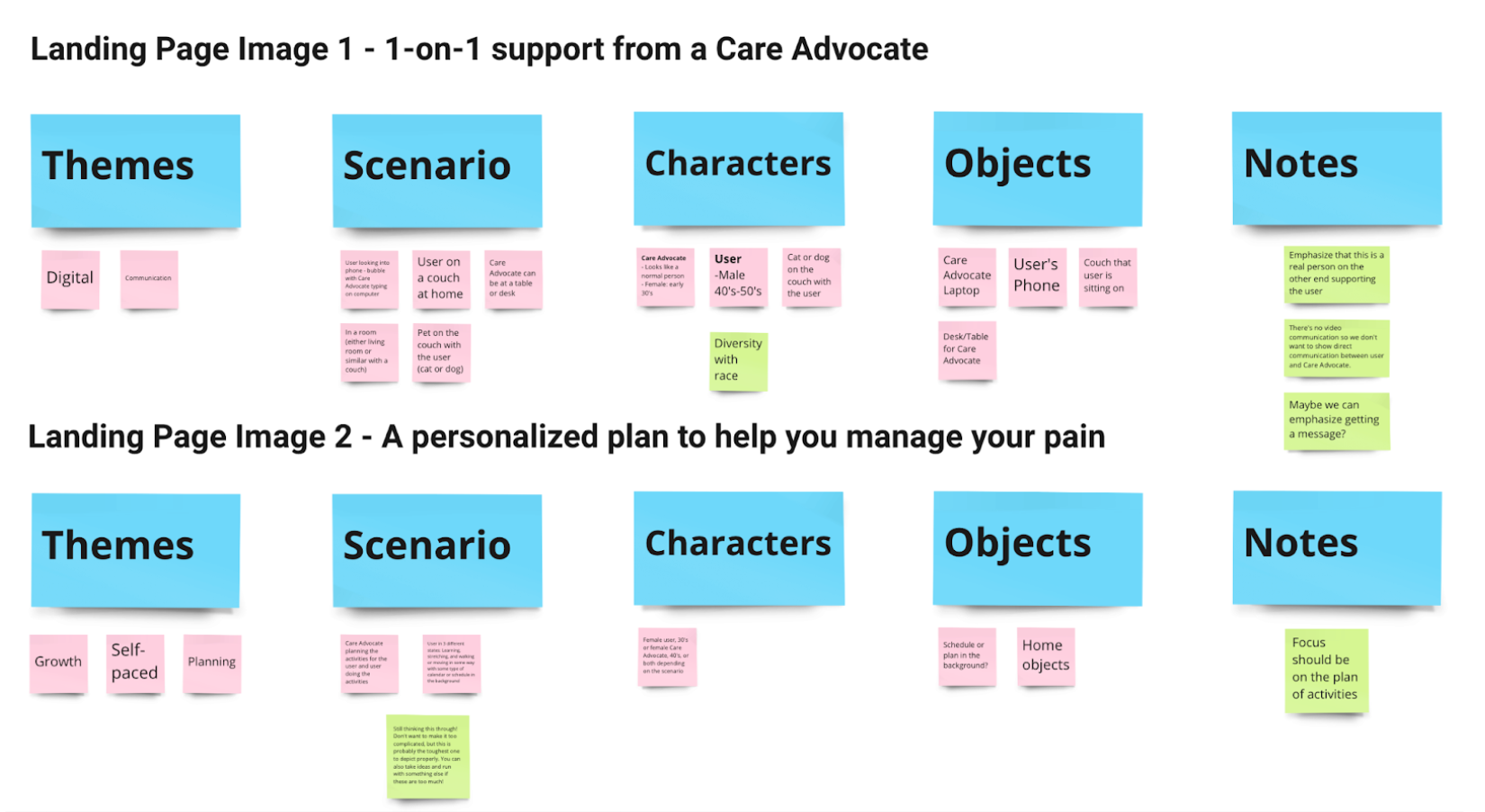
We went through several iterations of the illustrations and were met with branding complications and indecision of which colors and style to use, but we finally decided on a color palette and style and were able to deliver amazing illustrations.
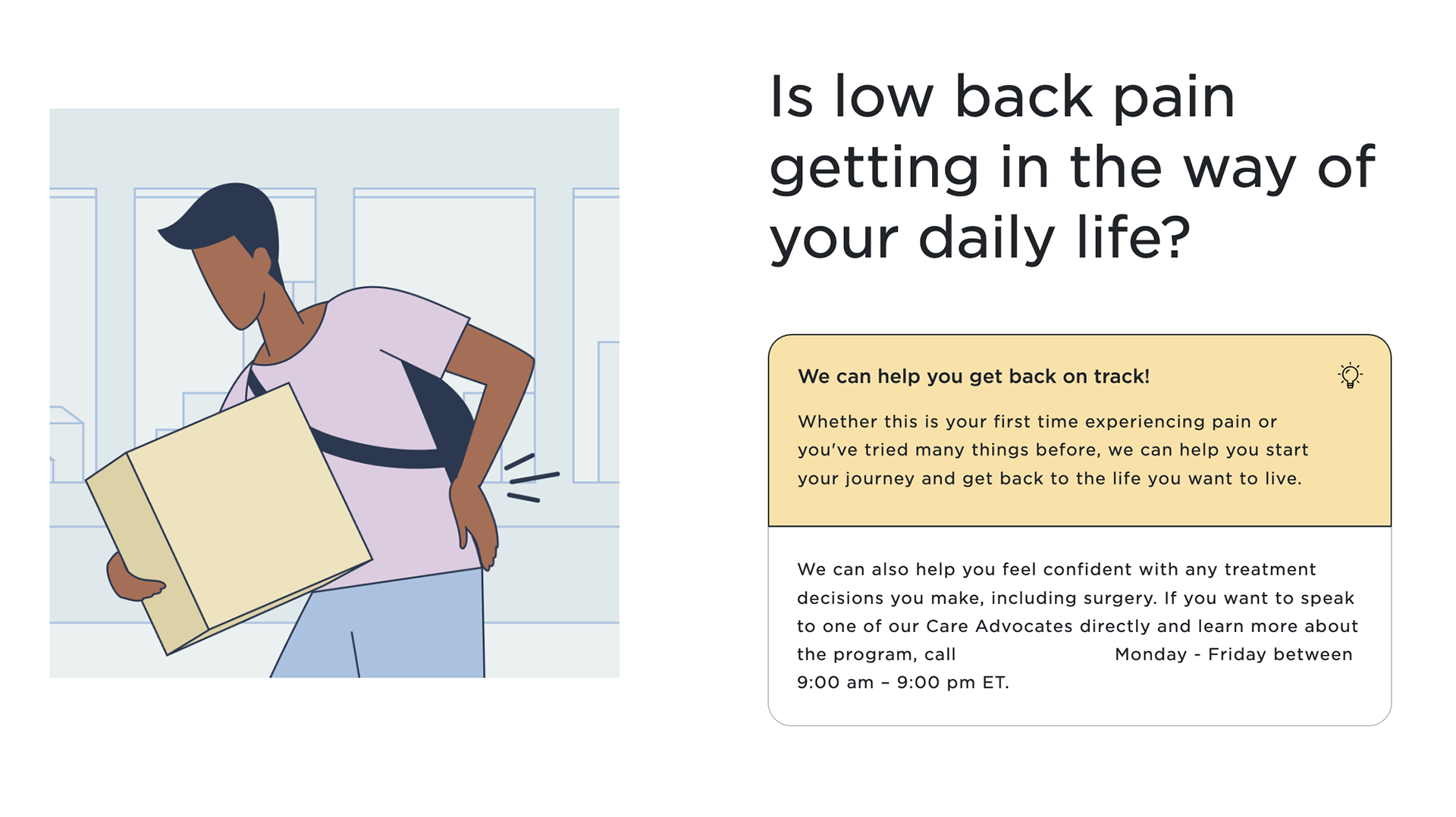
Here are a few illustrations we ended up using:
Step 5: Legal review
Once I made the final changes, I set up a meeting with the legal team. I walked through the different types of content we needed feedback on and sent it over for them to review.
We received a few notes that included terminology changes. We ended up having to remove “care plan” or “care path” because it crossed into a legal gray area of implying that we were providing care to the customer. We replaced any reference to the care plan with “activities.”
A decision was also made to use the term “Care Advocate” instead of “personal nurse,” as the Care Advocate could be a registered nurse or physical therapist. I worked with the developers and CMS team to update the terms on the landing page and went through the rest of the program to make sure there were no remaining references to the outdated terminology.
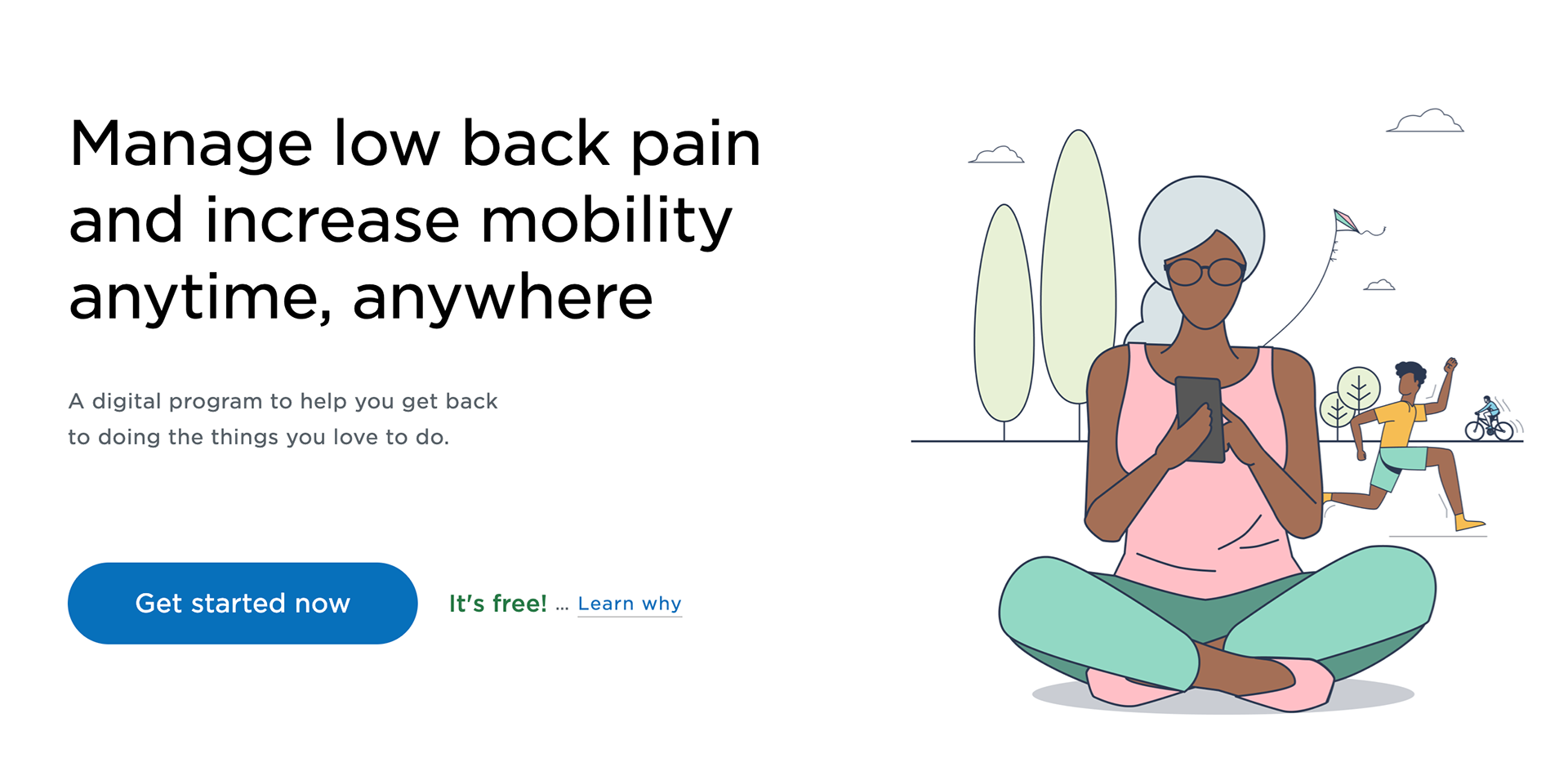
Current state
This is the current version we have. There have been several minor iterations, but the changes have mostly stayed the same since testing.
Impact
Our landing page conversion rate is currently 27%. We are hoping to improve that with the next landing page iteration.
Next Steps
We’re analyzing data and analytics to see how the landing page is performing in terms of number of signups. We're also creating a new landing page that is more general. This program will include conditions other than low back pain. We are preparing for another round of testing to see how to improve the landing page and increase the number of signups for this next iteration.
We also got feedback during testing that the landing page was really long on mobile, so we’re working on cutting down the length. This landing page will continue to evolve as the programs develop, but we will continue with user testing and analyzing data and metrics to support our continued changes.